
Amplifying Identity in a Crowded Category
A speculative case study on standing out in a growing industry.
The Challenge
The non-alcoholic beverage space has exploded with competition. Since Ghia’s launch in 2020, dozens of new brands have entered the market, many borrowing similar visual language and messaging. While Ghia has one of the most distinctive and well-developed brand identities in the category, standing out is no longer just about great branding. It’s about consistently reinforcing that identity in ways that feel fresh and memorable.


(Launched 2021)

(Launched 2021)

(Launched 2022)

(Launched 2022)

(Launched 2022)

(Launched 2023)
Defining the Objective
The goal of this speculative project was twofold: (1) increase awareness of Ghia’s ready-to-drink canned spritzes, and (2) give people a clear and compelling sense of what makes the brand unique. This wasn’t about rebranding or repositioning. Ghia already knows who it is. This was about helping that identity show up in a way that cuts through the noise. A ton of new competitors have entered the non-alcoholic drink market since Ghia launched. Leaning into what makes Ghia unique was key to this project.
Understanding the Plan
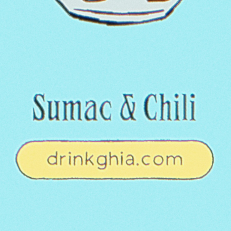
The deliverables for this projectconsist of a focused campaign of four animated assets, one for each of Ghia’s canned spritz flavors. Each animation was designed to work across social platforms, paid ads, and even in-store screens. The creative direction was rooted in three key ideas: Ghia’s Mediterranean influence, the unique flavor profiles of each spritz, and the energy of sharing a drink with others.

Mediterranean
Influence

Unique Flavor
Profiles

Social
Environments
Designing the Assets
Each 10-second animation begins with a can of Ghia’s spritz, which morphs into its core ingredients, like citrus, herbs, or botanicals, before transforming into a dreamy Mediterranean-inspired setting. The final transition returns to the can, tying the story back to the product. All animations were hand-drawn frame by frame, colored in Ghia’s bold palette, and brought to life with subtle texture and glow to match the brand’s warm, nostalgic aesthetic. Ambient soundscapes from Mediterranean cafés and light instrumental music added an immersive layer to the final experience.
Drawn By Hand


Mediterranean Inspiration


Executing the Strategy
The finished animations are short-form creative assets designed for flexible use across brand touchpoints. They can support social and email marketing, live as hero content on landing pages, or elevate physical brand moments through motion displays. More importantly, they serve the objective: helping Ghia reinforce what makes it different, not just by saying it, but by showing it.


Final Word
When more and more brands are fighting for attention, the ones that reinforce their identity in creative, emotional ways are the ones people remember. This speculative campaign shows how thoughtful, handcrafted animation can help a brand stay top of mind without changing a thing about who they are.
